DESIGN, DEVELOPMENT
& ARTISTIC DIRECTION
& ARTISTIC DIRECTION
FLORIDA | USA
SKILLS
VISUAL, UI/UX, PRODUCT, GAME & WEB DESIGN
HTML, CSS, SWIFT, JS, & FRONTEND DEVELOPMENT
CHARACTER MODELING, CONCEPT ART & ILLUSTRATION
HTML, CSS, SWIFT, JS, & FRONTEND DEVELOPMENT
CHARACTER MODELING, CONCEPT ART & ILLUSTRATION
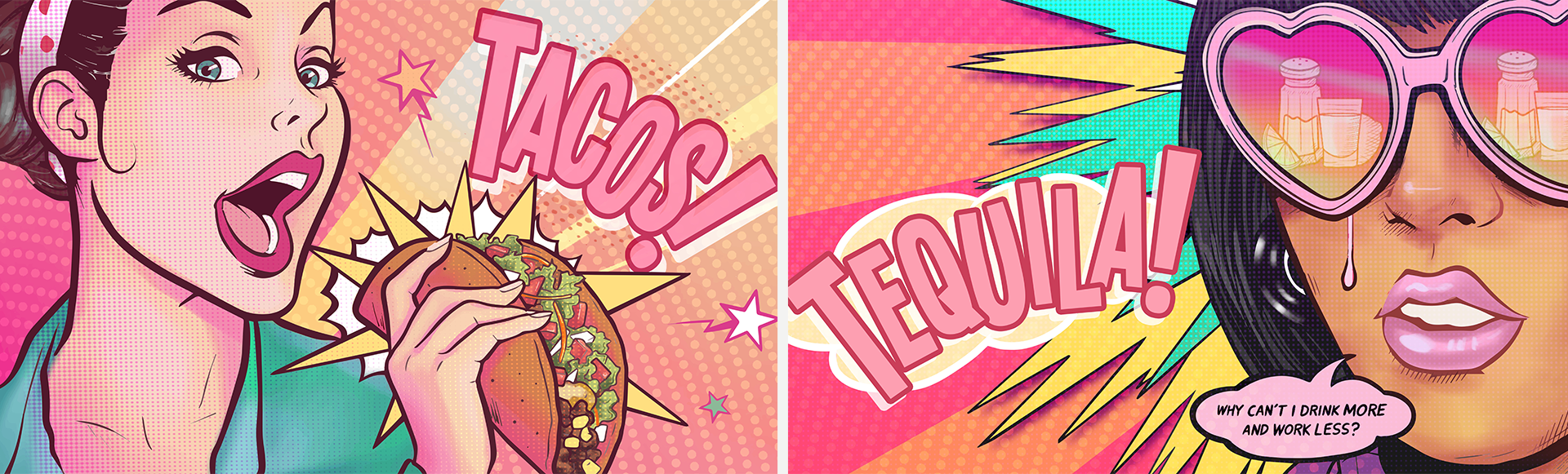
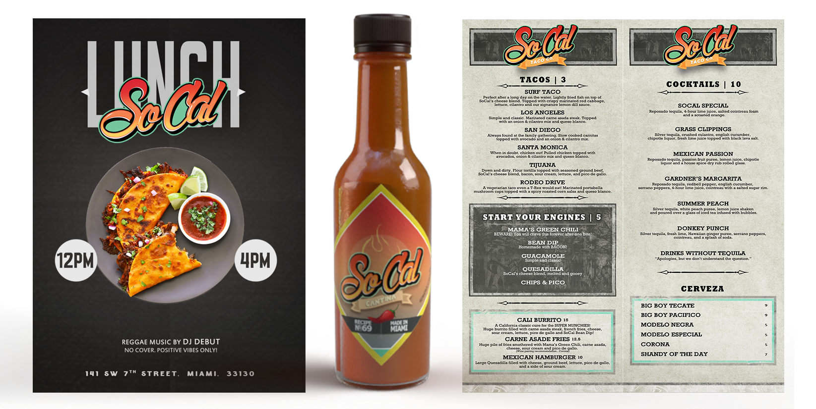
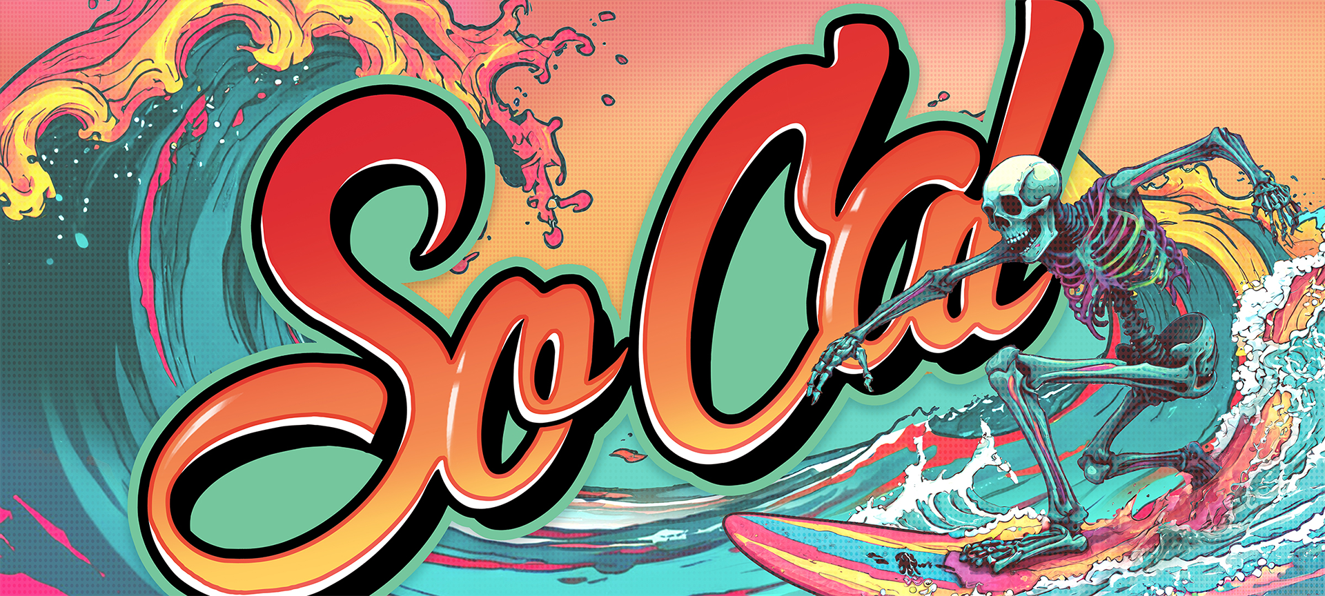
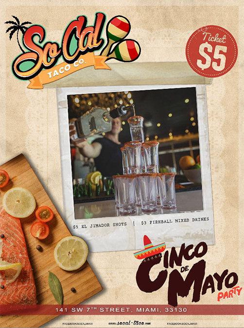
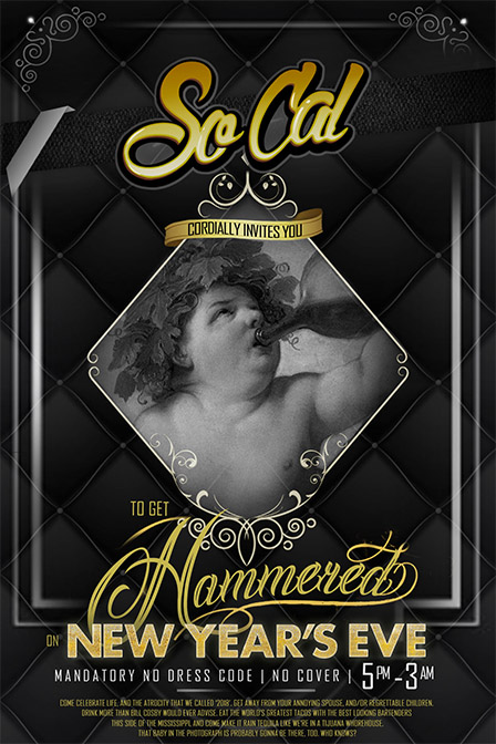
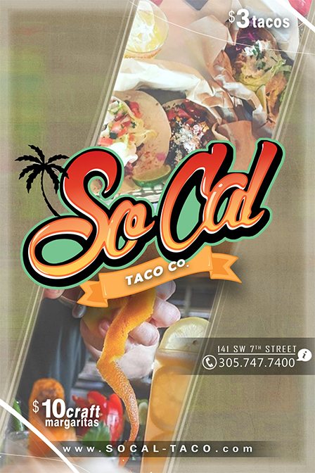
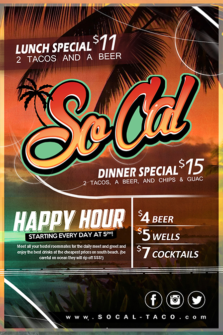
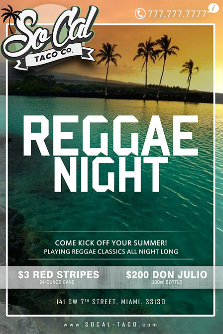
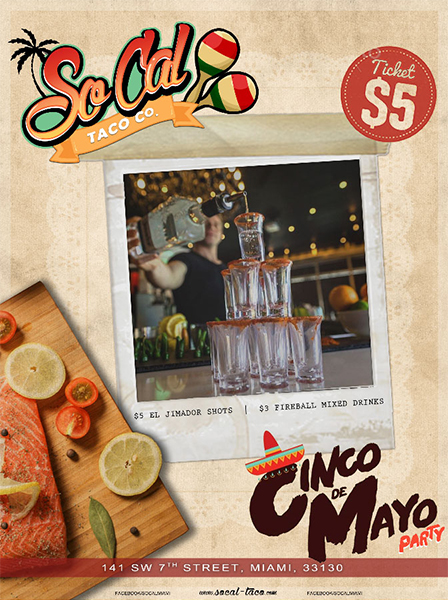
So Cal Taco Co. \ SOUTHERN CALIFORNIA INSPIRED CHAIN RESTAURANT.
I developed a comprehensive brand identity for So Cal Taco Co., creating a visual system that captures the energy
and authenticity of California's taco culture. The challenge was balancing traditional Mexican elements
with contemporary California style to appeal to a diverse, food-savvy audience.